The Role of Dashboards in B2B Sales: 2026 Guide
TL;DR:
- Sales dashboards provide real-time visibility into key metrics, helping sales teams forecast, coach, and decide more effectively.
- Designing role-specific dashboards with clear decisions and context significantly boosts adoption and performance.
A sales dashboard is a real-time visual tool that consolidates essential B2B sales metrics and KPIs into a single view, giving sales teams the clarity they need to hit their targets. The role of dashboards in B2B sales has grown sharply: usage rose from 54% in 2023 to 67.7% in 2026 among business leaders. That 13.7 percentage point jump in three years signals a fundamental shift. Sales teams that once relied on weekly spreadsheet reports now expect live data at their fingertips. This guide covers how dashboards improve forecasting, coaching, and decision-making, and what it takes to build ones that actually move the needle.

How dashboards improve B2B sales forecasting accuracy
Forecasting is where dashboards deliver their most measurable impact. AI-powered dashboards improve forecast accuracy by approximately 28–30% and save sales operations teams 15–20 hours per week in manual reporting. That time recovery is close to half a standard work week. Sales managers who previously spent Monday mornings compiling pipeline reports can now spend that time reviewing deals and coaching reps.
The accuracy gain comes from how dashboards handle leading and lagging indicators. Leading indicators placed above lagging indicators in a dashboard layout improve cause-and-effect visualization. A rep’s meetings booked this week (leading) sits above revenue closed this month (lagging). That proximity helps managers spot problems before they become missed quarters.
Real-time visibility also improves CRM data quality. Live feedback from dashboards encourages reps to keep their CRM records accurate and act on leads faster. When reps see their own pipeline metrics update in real time, they have a direct incentive to log calls and update deal stages promptly.
Key forecasting metrics worth tracking on your dashboard:
- Meetings booked (leading indicator): predicts near-term pipeline growth
- Pipeline coverage ratio: shows whether you have enough deals to hit quota
- Average deal cycle length: flags slowdowns before they hit revenue
- Win rate by stage: identifies where deals stall most often
- Quota attainment per rep: surfaces who needs support before the quarter ends
Pro Tip: Connect your forecasting dashboard directly to your CRM so deal stage changes update automatically. Manual data entry breaks the real-time advantage entirely.
How do dashboards support sales coaching and team performance?
Coaching is the highest-impact activity a sales manager can do. According to the Sales Executive Council, cited in Harvard Business Review, coaching is the single most effective lever for improving rep performance. Dashboards make that coaching possible by removing the administrative work that normally crowds out a manager’s calendar.
Without a dashboard, a manager spends hours each week pulling reports, chasing reps for updates, and building slides for leadership. With one, that work disappears. The manager walks into a one-on-one already knowing which deals are stalled, which reps are behind on activity, and where the biggest gaps are. The conversation starts at the problem, not at the data.
75% of business leaders report measurable performance gains after adopting analytics-based decision-making for their sales teams. That result reflects a shift from reactive management to proactive coaching. Managers stop reacting to last quarter’s numbers and start shaping this quarter’s outcomes.
Here is how to use dashboards to build a coaching system that works:
- Review individual rep dashboards weekly. Look at activity metrics first: calls made, emails sent, meetings booked. Low activity almost always precedes low revenue.
- Compare pipeline velocity across reps. A rep with a long average deal cycle may need help with objection handling, not prospecting.
- Use real-time alerts for stalled deals. Set thresholds so you get notified when a deal has not moved stages in 14 days.
- Share rep-level dashboards with the reps themselves. Reps who see their own data take more ownership of their results.
- Tie dashboard metrics to specific coaching conversations. Never review data without connecting it to a behavior change or next action.
Pro Tip: Build a separate manager view and a separate rep view from the start. Managers need pipeline totals and team comparisons. Reps need their own daily priorities. One shared view serves neither well.
What are the key design principles for B2B sales dashboards?
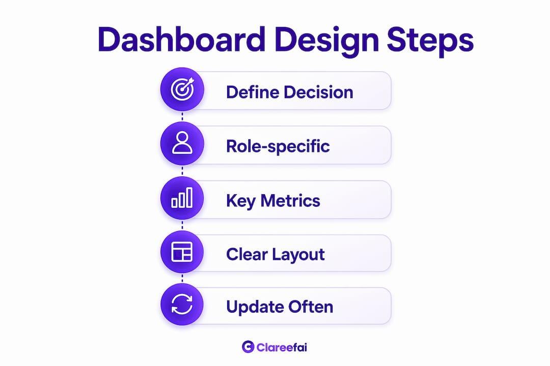
Dashboard design determines whether your team uses the tool or ignores it. Each dashboard view should answer one question and use clear labels that match how users already think about their work. This reduces cognitive load and drives faster decisions. A dashboard that tries to answer ten questions at once answers none of them well.
Role-based dashboards tailored to executives, managers, and reps outperform generic, one-size-fits-all views. Each role needs different data at different frequencies. An executive checking in monthly needs a different view than a rep starting their workday. Forcing both to use the same screen wastes time and creates confusion.
Executives need 3–5 high-level KPIs with exception alerts, while reps require daily, prioritized data they can act on immediately. That design gap is wider than most teams expect. Building one dashboard and calling it done is the most common mistake in B2B sales analytics.
| Role | Primary need | Recommended metrics |
|---|---|---|
| Executive | High-level performance overview | Revenue vs. target, win rate, pipeline value |
| Sales manager | Team and rep-level visibility | Activity by rep, pipeline coverage, forecast accuracy |
| Sales rep | Daily priorities and personal progress | Calls due, open deals, quota attainment |
Design rules that separate good dashboards from ignored ones:
- One question per view. “Is my team on track to hit quota this month?” is one question. Build one screen for it.
- Lead with leading indicators. Show activity metrics before revenue metrics so managers can act early.
- Use labels your team already uses. If your team calls it “a discovery call,” do not label it “initial qualification meeting.”
- Limit colors to three or fewer. More colors add visual noise without adding meaning.
- Place exception alerts prominently. If a deal is at risk, that signal should be impossible to miss.
What pitfalls should you avoid when aligning dashboards with decisions?
The most common dashboard failure is building one without defining what decision it supports. Dashboards built without a clear decision framework generate noise instead of clarity. A beautiful chart that no one acts on is just decoration. Before you build any dashboard, name the specific decision it will inform and who makes that decision.
Aligning dashboard update frequency with decision cadence matters just as much as the data itself. A dashboard that updates daily is useful for weekly pipeline reviews. That same dashboard is noise during quarterly budget planning, where you need trend lines and period comparisons, not yesterday’s call count. Matching update frequency to decision cadence reduces clutter and keeps attention on what matters.
Pairing dashboards with narrative memos solves the interpretation problem that kills adoption. A memo explains what the data shows, why it matters, and what the team should do next. Without that context, two managers looking at the same chart will reach two different conclusions.
A dashboard shows you what happened. A narrative memo tells you what to do about it. You need both.
Governance rules that prevent dashboard sprawl:
- Assign one owner per dashboard who is responsible for keeping it current and relevant.
- Review all dashboards quarterly and retire any that no longer support an active decision.
- Document the decision each dashboard supports in a shared reference so new team members understand its purpose.
- Require a written decision outcome before any new dashboard gets built.
Key Takeaways
Dashboards drive B2B sales performance when they are role-specific, tied to clear decisions, and paired with narrative context that tells teams what to do next.
| Point | Details |
|---|---|
| Adoption is accelerating | Dashboard usage among business leaders reached 67.7% in 2026, up from 54% in 2023. |
| Forecasting gains are measurable | AI-powered dashboards improve forecast accuracy by 28–30% and save 15–20 hours per week. |
| Coaching is the highest ROI use | Dashboards free managers from admin work so they can focus on rep development. |
| Design by role, not by default | Executives, managers, and reps each need distinct views with different metrics and update frequencies. |
| Decisions must come before dashboards | Define the specific decision a dashboard supports before building it, or it becomes noise. |
What I have learned from watching teams use dashboards wrong
Most sales teams treat dashboards as a reporting exercise. They build them, share them, and then wonder why nothing changes. The real problem is that data without a decision framework is just a mirror. It shows you where you are. It does not tell you where to go.
The teams I have seen get real results from their sales analytics do two things differently. First, they assign a decision to every dashboard before they build it. Second, they pair every dashboard with a short written memo that names the problem, explains why it matters, and recommends a specific action. That combination turns a passive report into a weekly decision engine.
The other thing worth saying plainly: role-specific design is not optional. A rep who opens a dashboard and sees executive-level revenue totals learns nothing useful about their day. An executive who sees a rep’s call log wastes time. Investing in separate views for each role is the single highest-return design decision you can make.
The risk I see most often is what I call data false security. A team builds a great dashboard, adoption goes up, and leadership assumes the analytics problem is solved. It is not. Dashboards need to evolve as your sales process changes. Build a feedback loop where reps and managers flag metrics that no longer reflect reality. The best dashboard you have today will be the wrong dashboard in 18 months if you do not maintain it.
Social proof data belongs in that feedback loop too. When you track which customer testimonials accelerate deals, you surface a leading indicator most teams miss entirely.
— ClareefAi
Clareefai and the analytics layer your sales dashboard is missing
Sales dashboards show you pipeline health and rep activity. What most dashboards do not show is the social proof layer: which customer stories are closing deals, which testimonials are building trust at the decision stage, and which advocates are actively influencing prospects.
Clareefai fills that gap. The platform collects, verifies, and displays customer testimonials and success stories in a centralized dashboard built for B2B sales teams. You can see which advocates are driving referrals, which reviews are converting prospects, and how social proof is performing across your funnel. The win rate impact is visible in the data, not just in anecdotes. If your sales dashboard tracks what your team does but not what your customers say, you are working with half the picture. Visit Clareefai to see the full view.
FAQ
What is the role of dashboards in B2B sales?
Sales dashboards consolidate real-time metrics and KPIs into a single view, giving sales teams the visibility they need to forecast accurately, coach reps effectively, and make faster decisions. Their role is to replace manual reporting with live data that drives action.
How do dashboards improve sales forecasting?
AI-powered dashboards improve forecast accuracy by approximately 28–30% by combining leading and lagging indicators in real time. That combination lets managers spot pipeline risks weeks before they affect revenue.
What metrics should a B2B sales dashboard include?
A well-designed B2B sales dashboard should include meetings booked, pipeline coverage ratio, average deal cycle length, win rate by stage, and quota attainment per rep. Leading indicators should appear above lagging ones to support early intervention.
Why do some sales dashboards fail to drive results?
Dashboards fail when they are built without a defined decision they are meant to support. Without a clear decision framework and a narrative memo explaining what the data means, teams interpret the same charts differently and take no consistent action.
How often should B2B sales dashboards be updated?
Update frequency should match the decision cadence the dashboard supports. Daily updates work for weekly pipeline reviews. Quarterly planning sessions need trend data over longer periods, not daily snapshots.